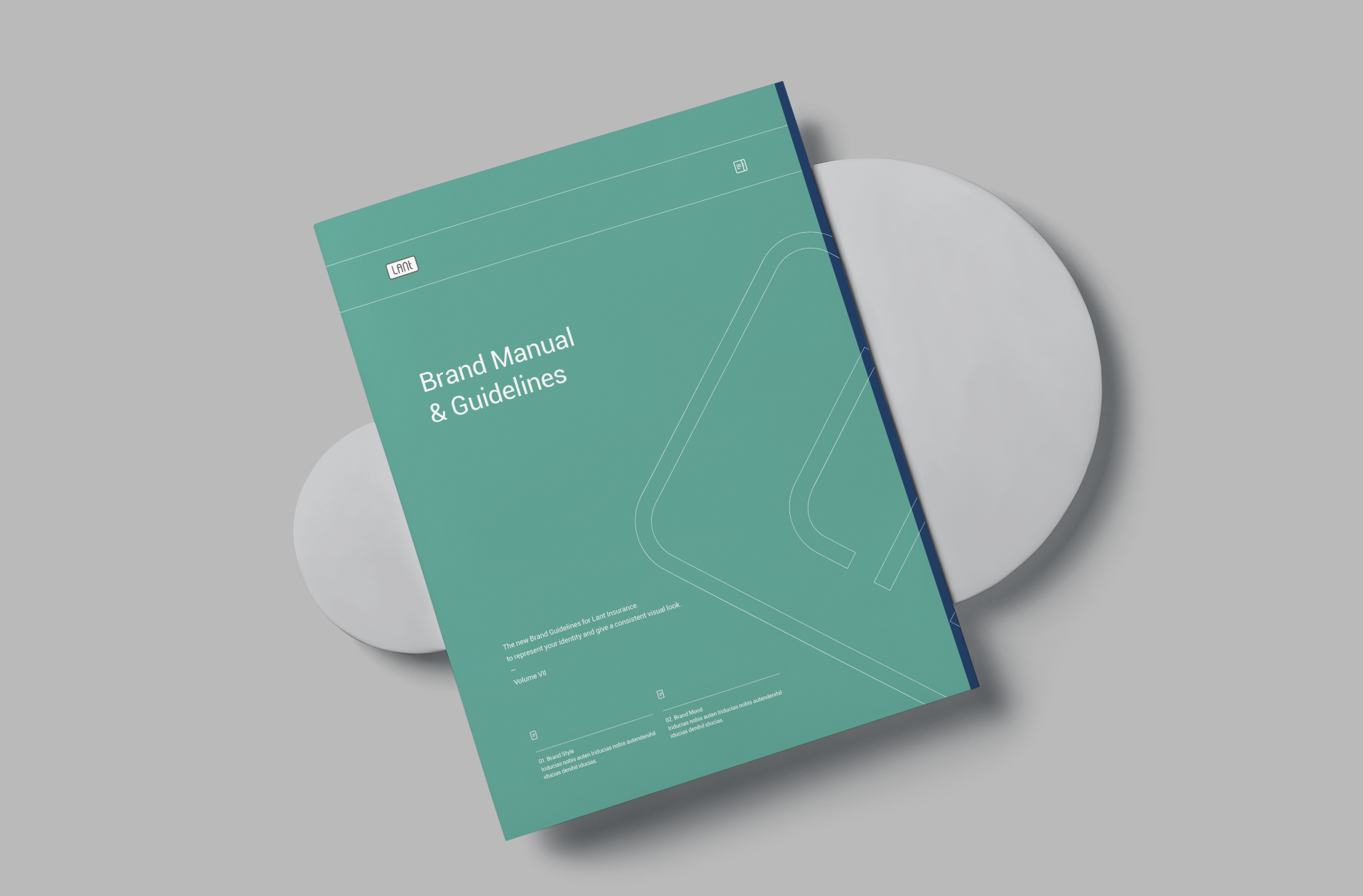
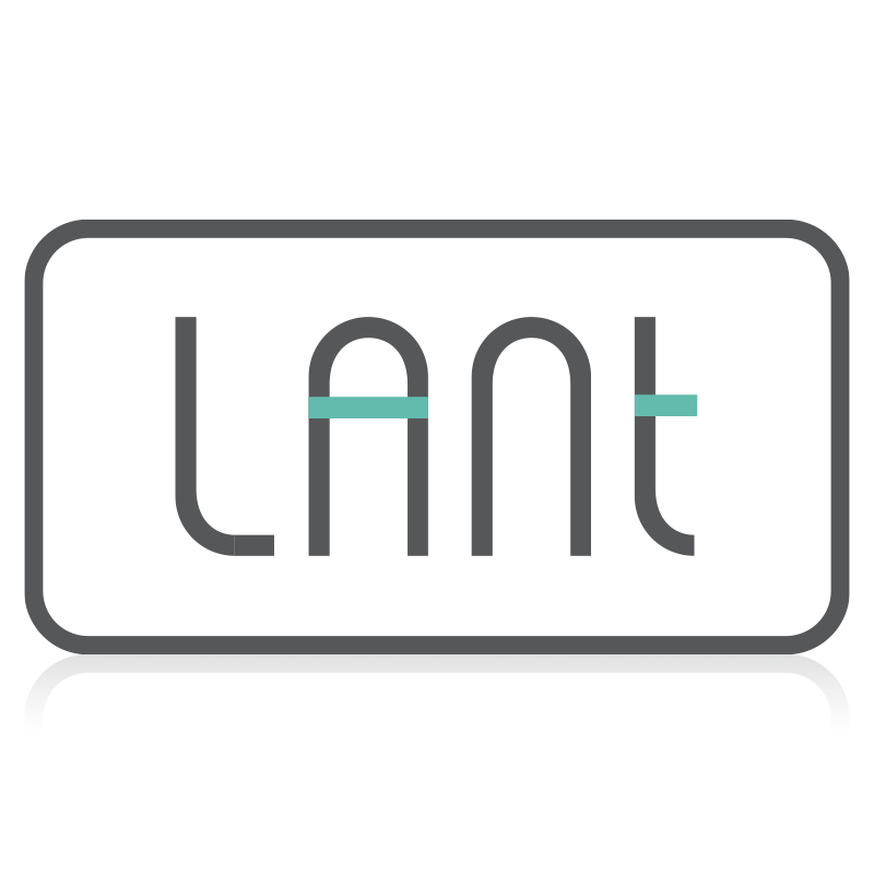
LANT BRAND IDENTITY
BRANDING / LOGO DESIGN
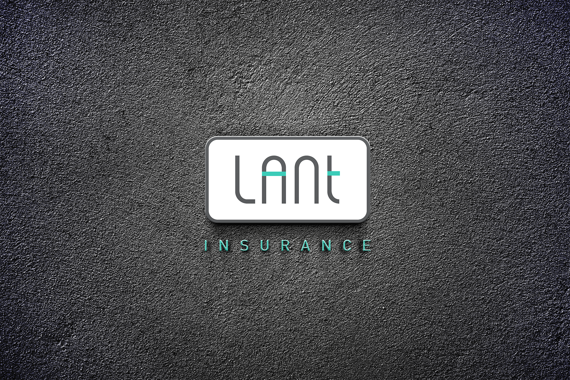
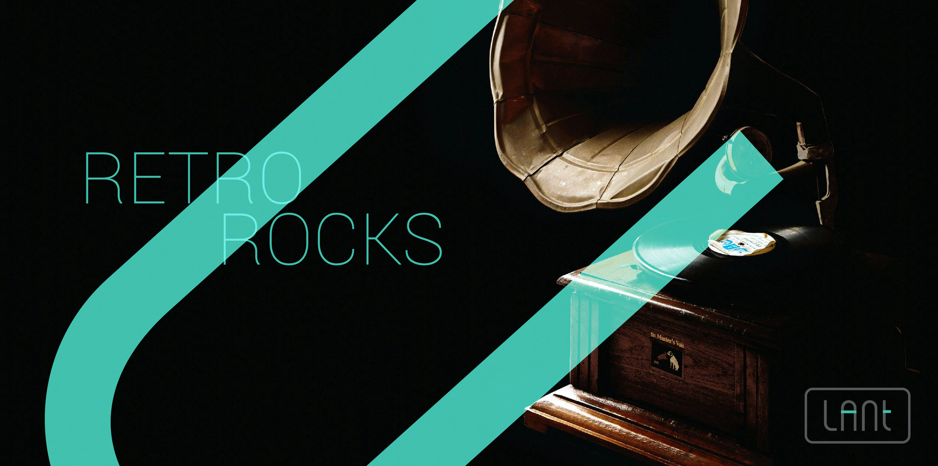
Elegance and Assurance: Lant Insurance's Timeless New Twist!
VERTICAL
INSURANCE
CHALLENGE
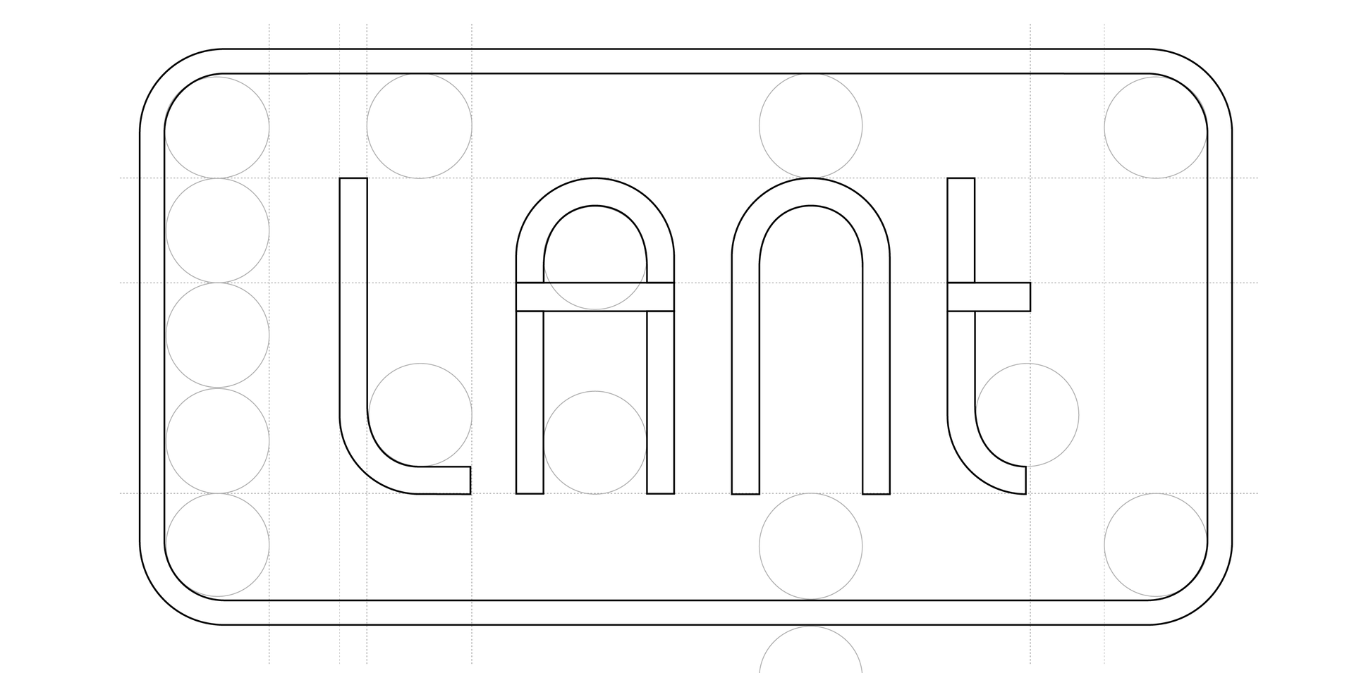
Overcoming a Generic Legacy
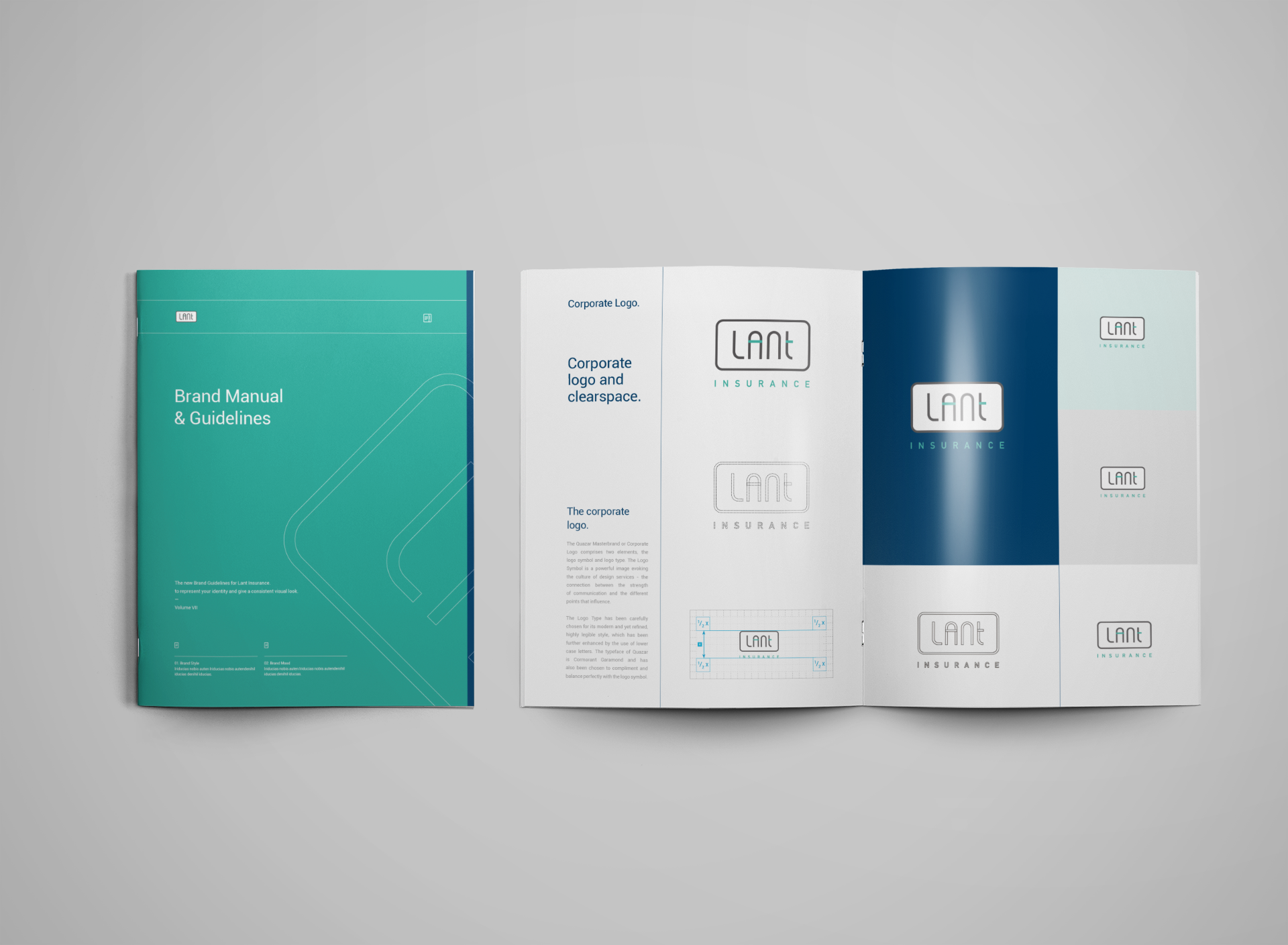
The challenge was unmistakable: the existing logo of Lant Insurance was a plain Jane – a mere Arial font with no unique features to distinguish it in the bustling market. It was essential to break away from this nondescript image and create something that not only caught the eye but also told a story. The logo’s lack of character was a blank canvas awaiting a transformation that could breathe life and identity into the brand.
SOLUTION
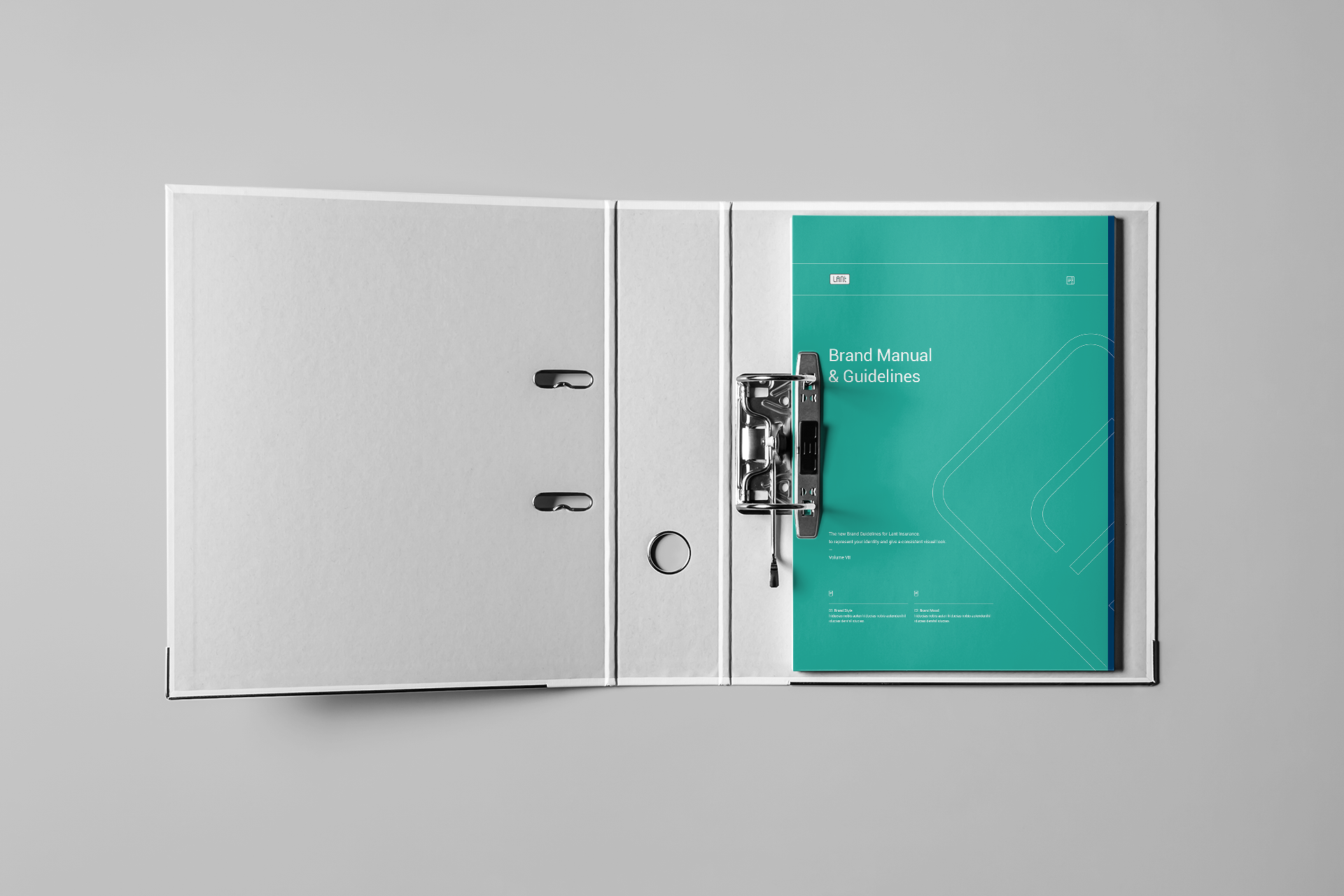
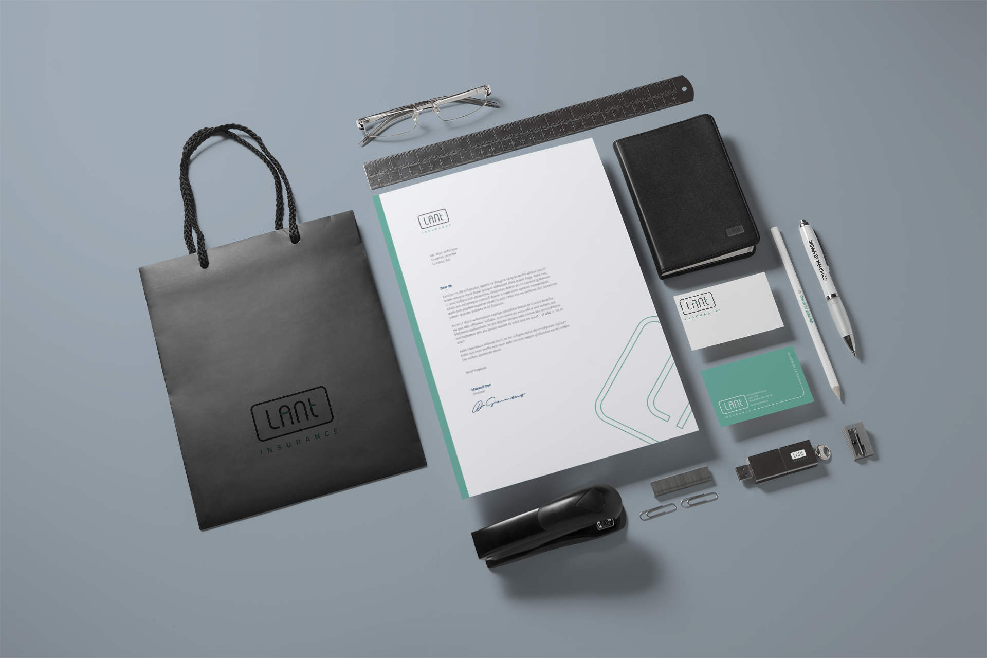
Crafting a New Identity
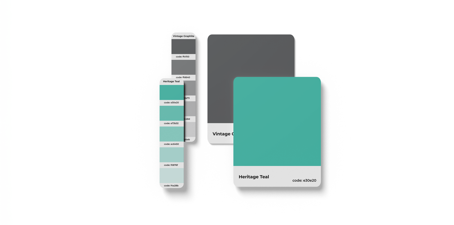
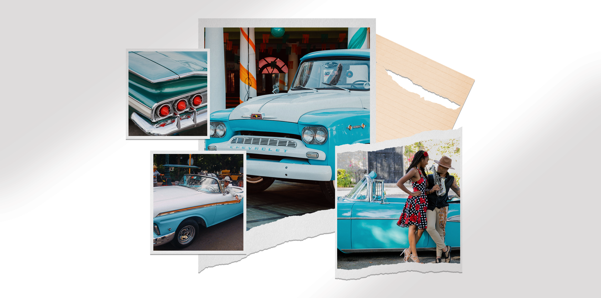
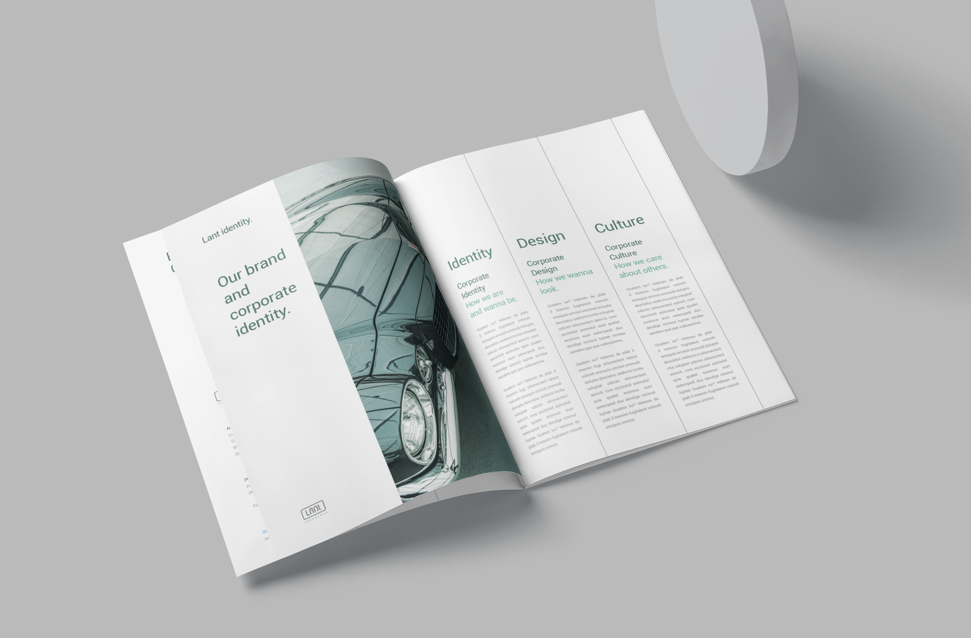
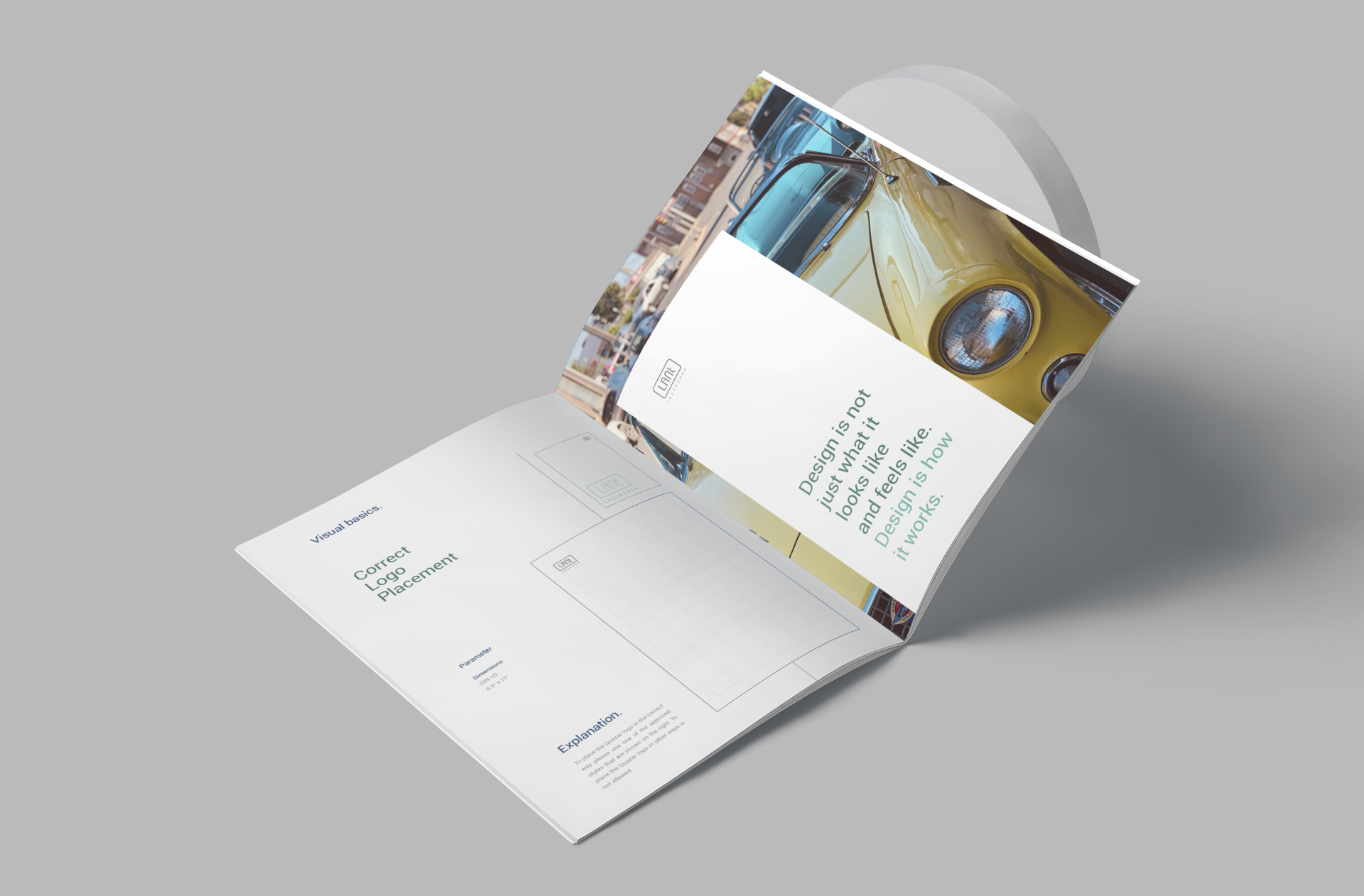
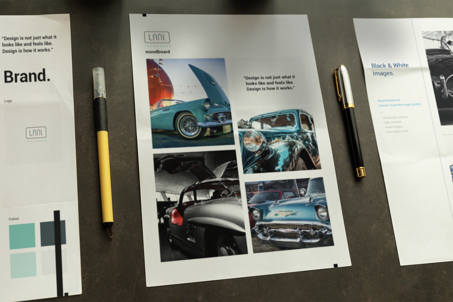
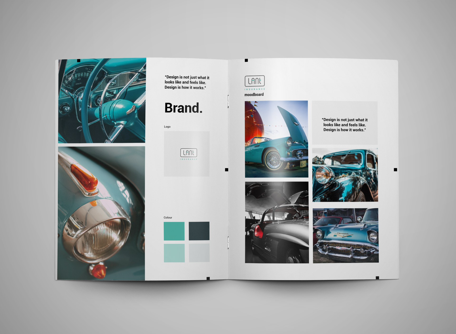
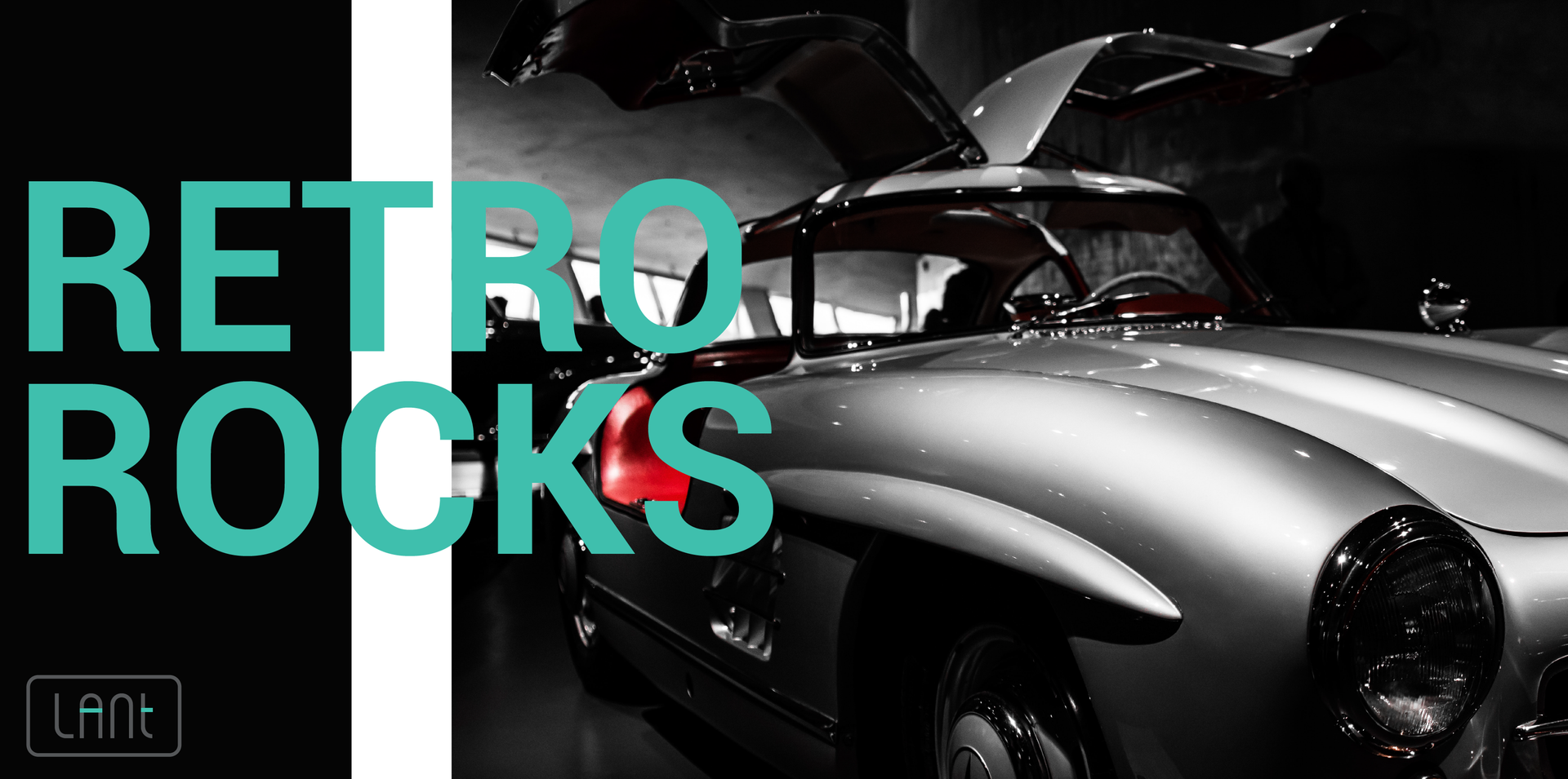
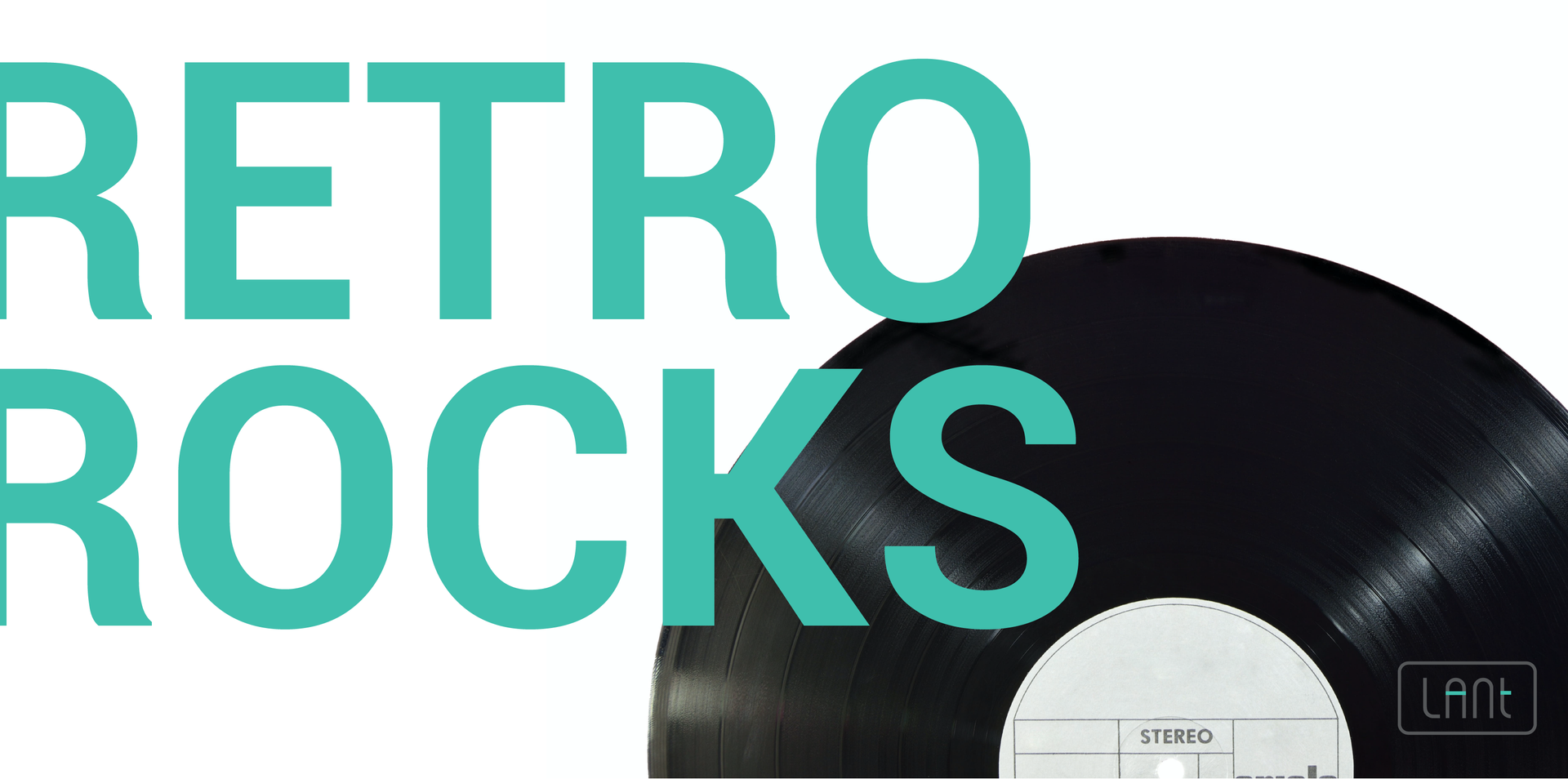
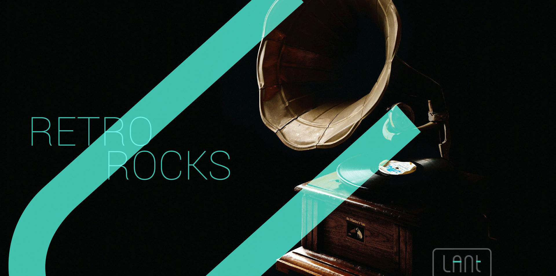
The breakthrough came during an insightful strategy session with the client. We delved into the heart of the brand, uncovering the core values that Lant Insurance stood for. It was clear that the brand was about more than transactions; it was about building familial bonds with clients, echoing the warmth and trust of a family unit. We drew inspiration from the unique, curved shapes of classic cars – symbols of elegance and personal touch. This led to the ingenious idea of integrating a license plate design into the logo, representing the highly personalized nature of the hobby and the client's business. This new brand identity was a harmonious blend of tradition, personalization, and a deep understanding of the client's needs – a true representation of Lant Insurance's renewed vision.
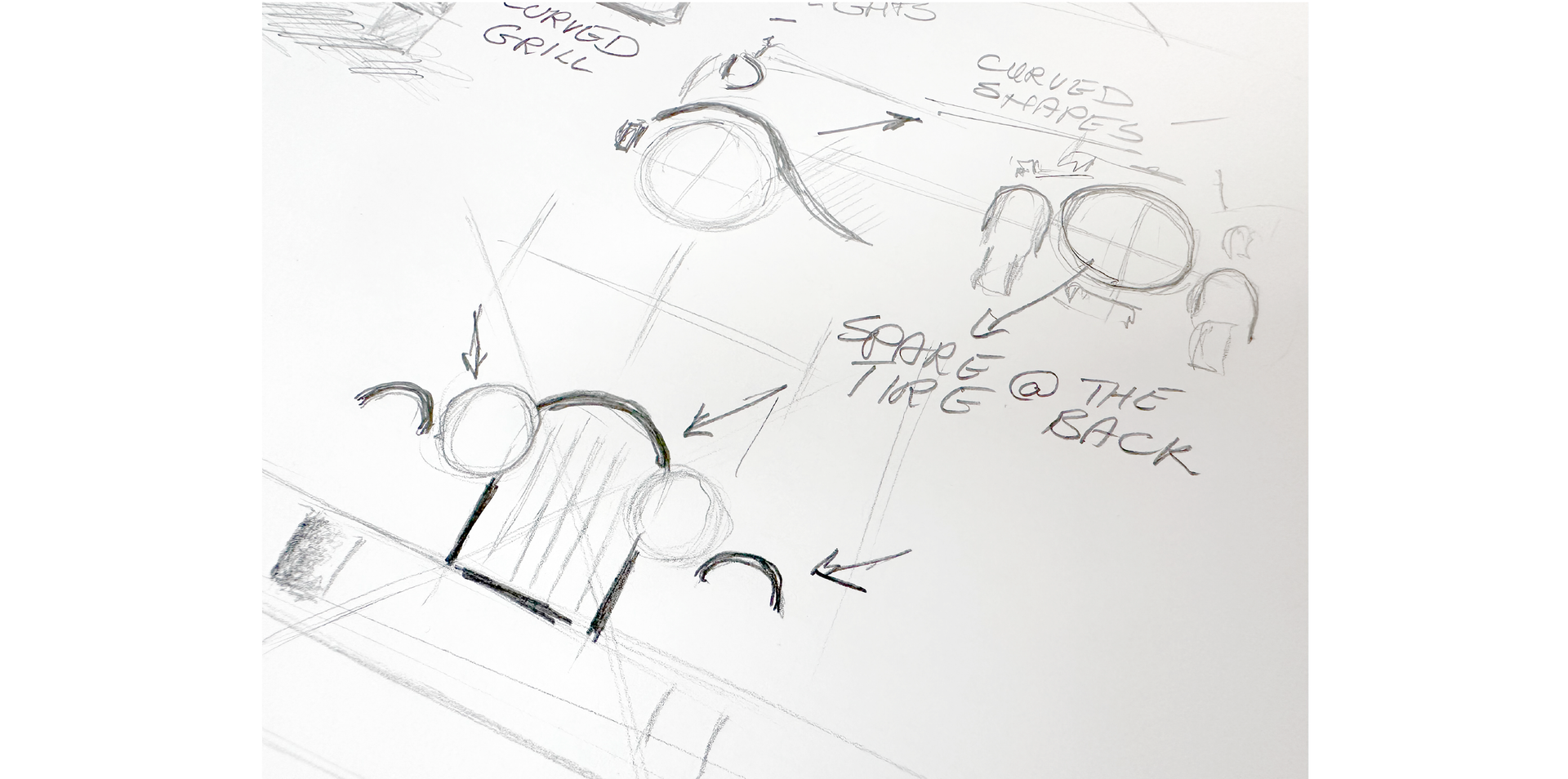
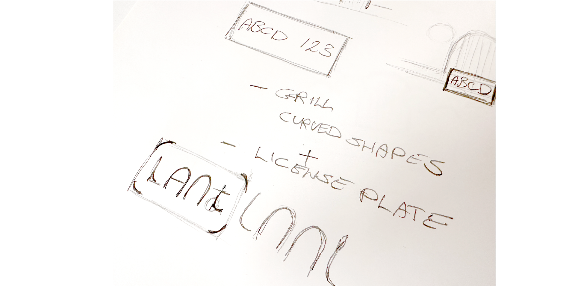
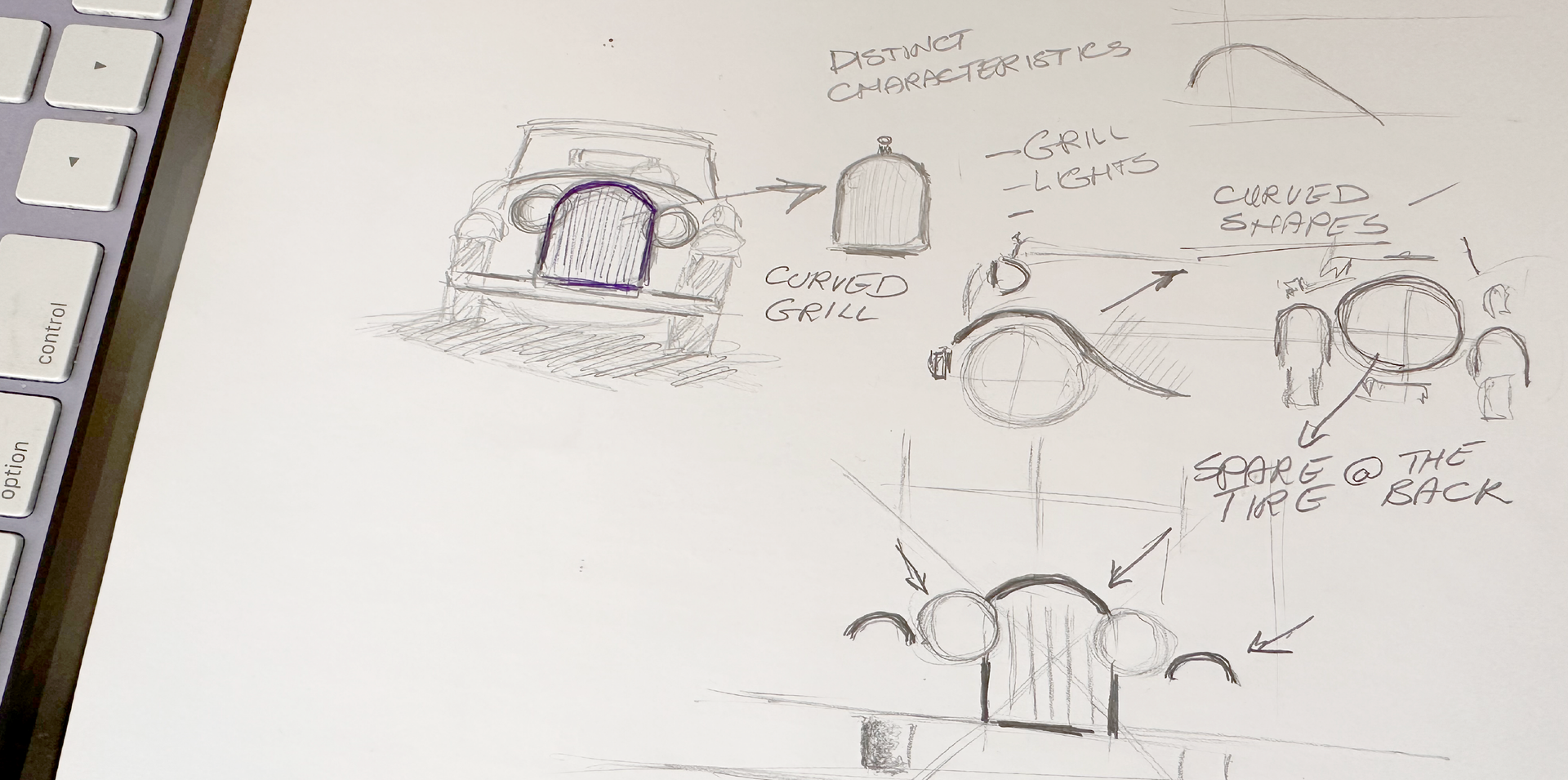
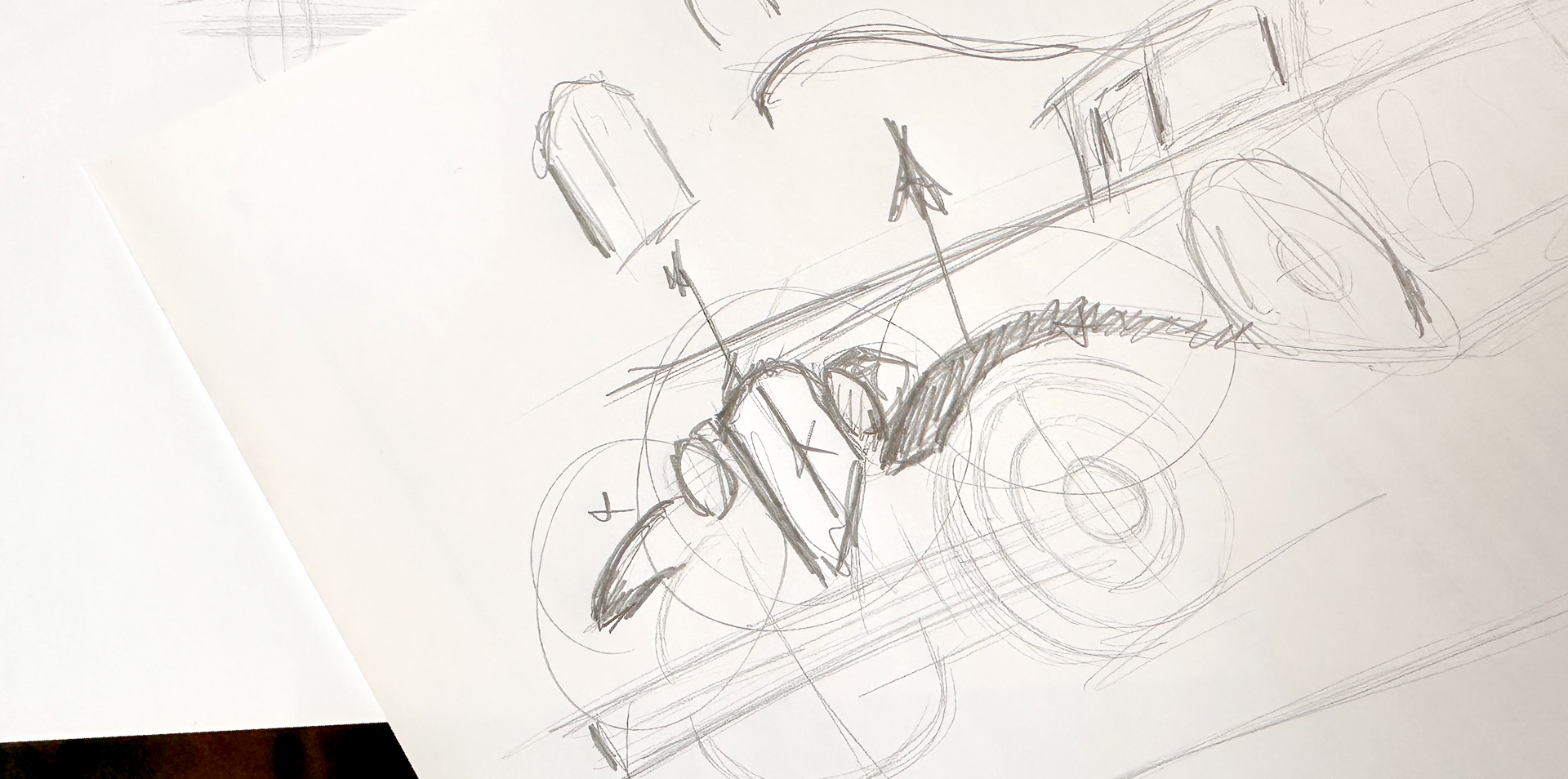
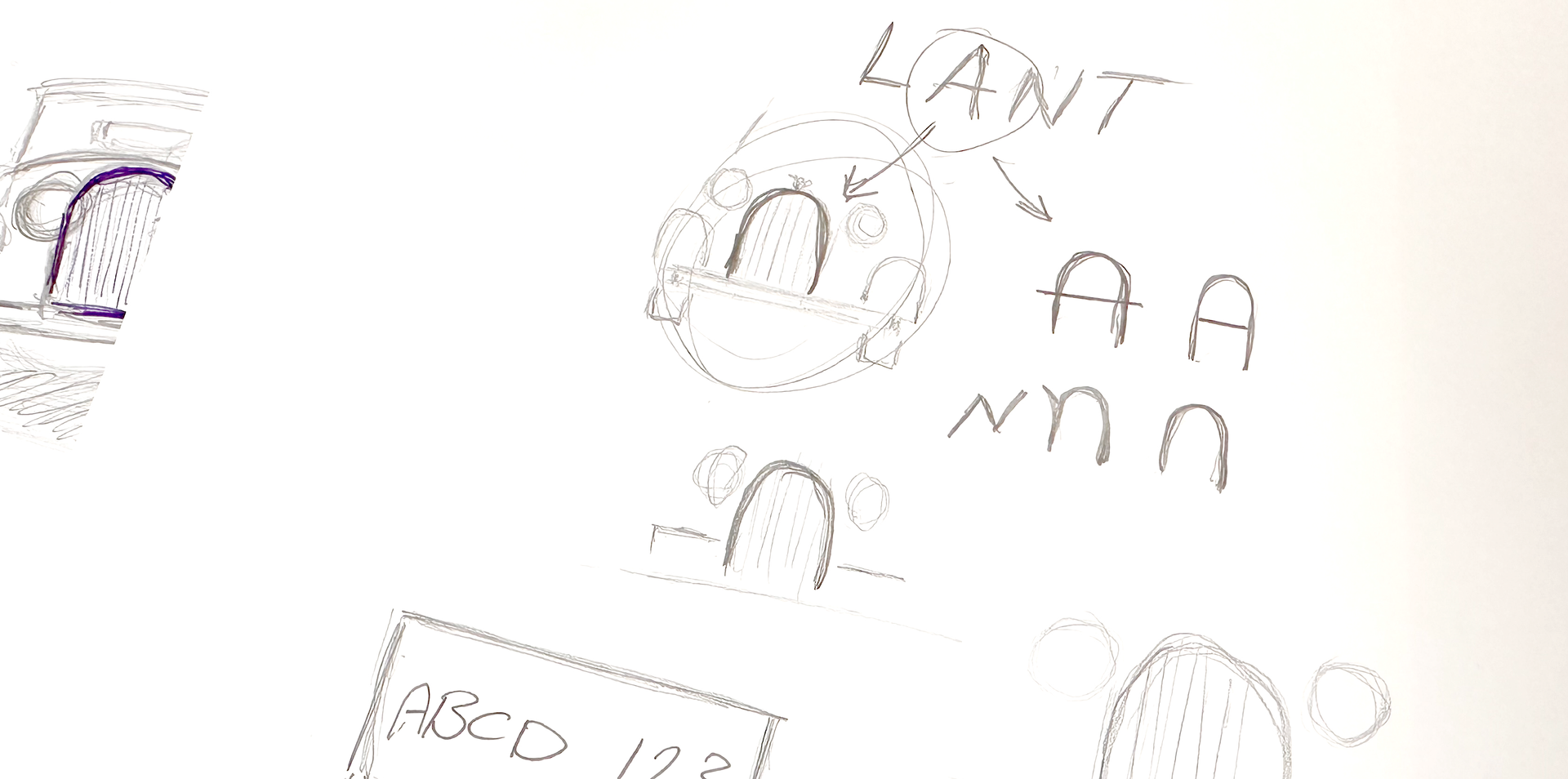
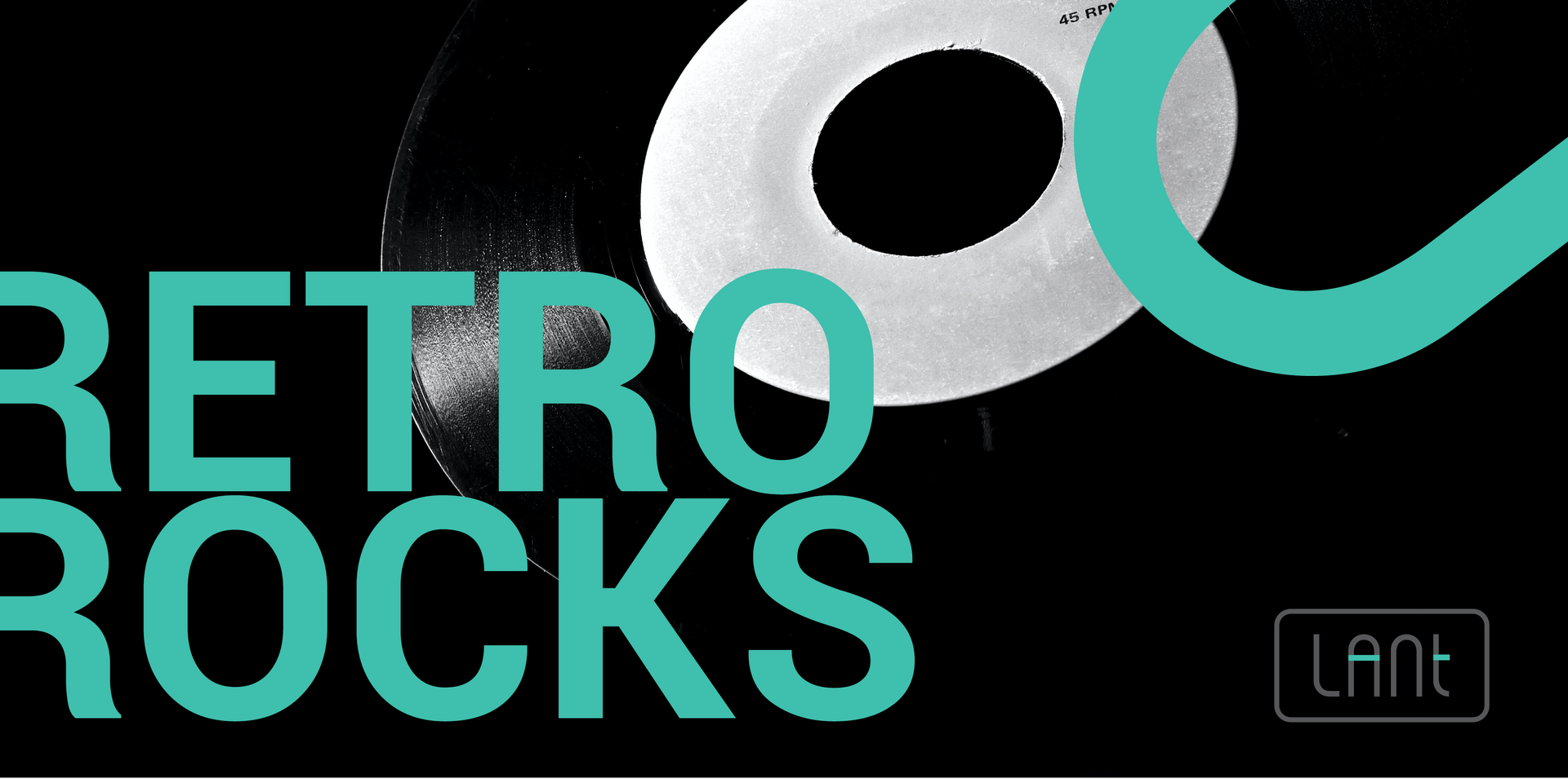
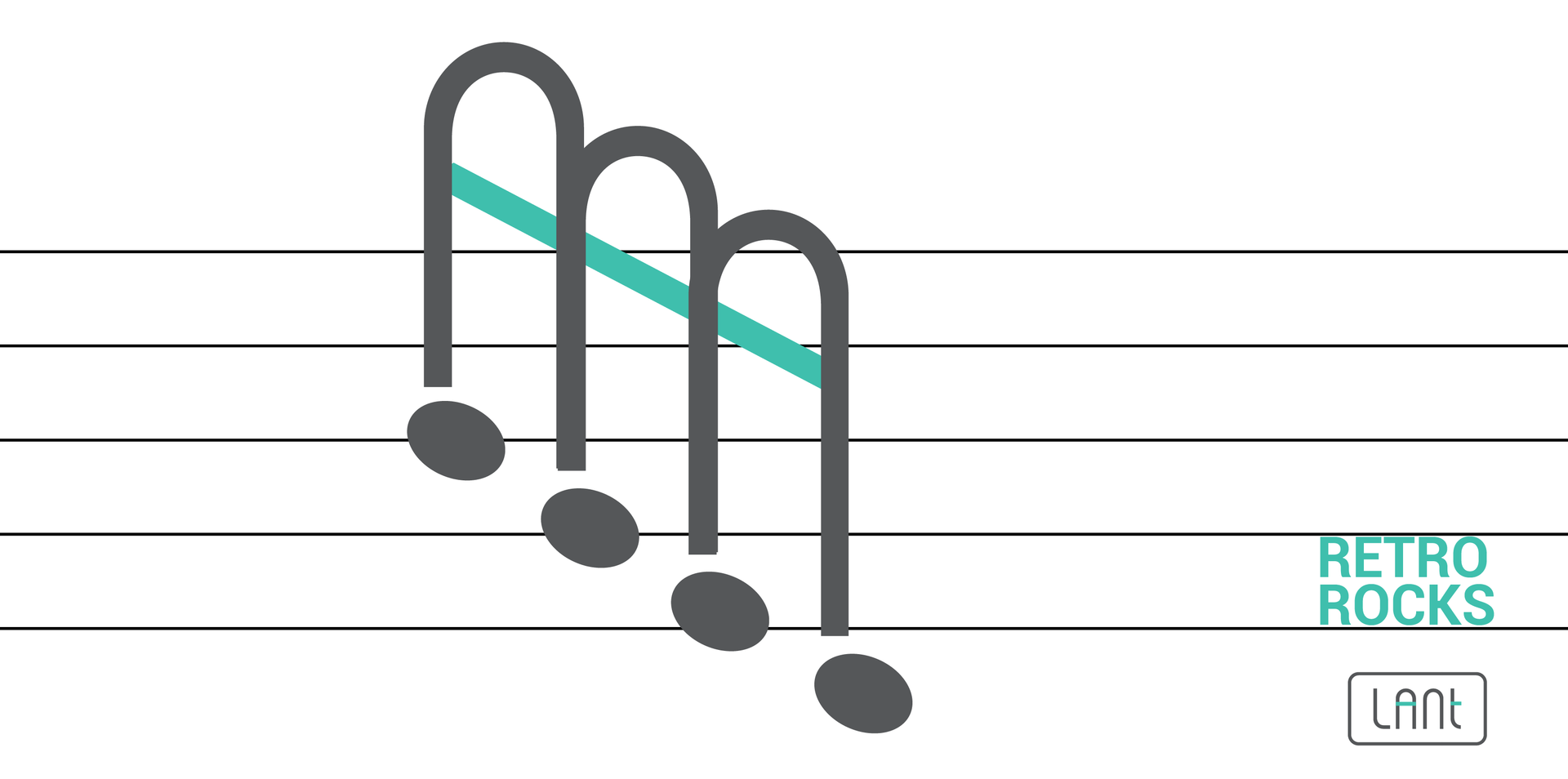
With their unique connection to a time past, classic cars stir up our thoughts and emotions like few other things. We wanted this special feeling to be the inspiration for our brand design.
"ArtBeat'S work was phenomenal. I’ve done a lot of rebranding in my career, and the team understood the essence of our business and delivered a logo and a creative campaign that absolutely knocked it out of the park."
Fabian Aird,
Marketing Director
Click on a thumbnail to view the gallery